Logo
Volt logo usage guidelines
Volt logo
Our logo is the core of our brand identity. Clean, modern, and distinctive, it ensures strong recognition in all markets.
Primary logo
The primary Volt logo should be used in all key brand touch points for maximum recognition. Maintain clear spacing, use approved colours, and avoid alterations to ensure consistency and impact.
![]()
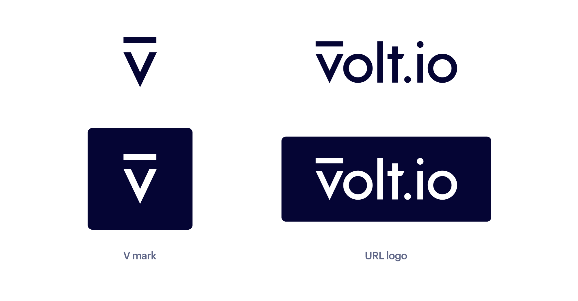
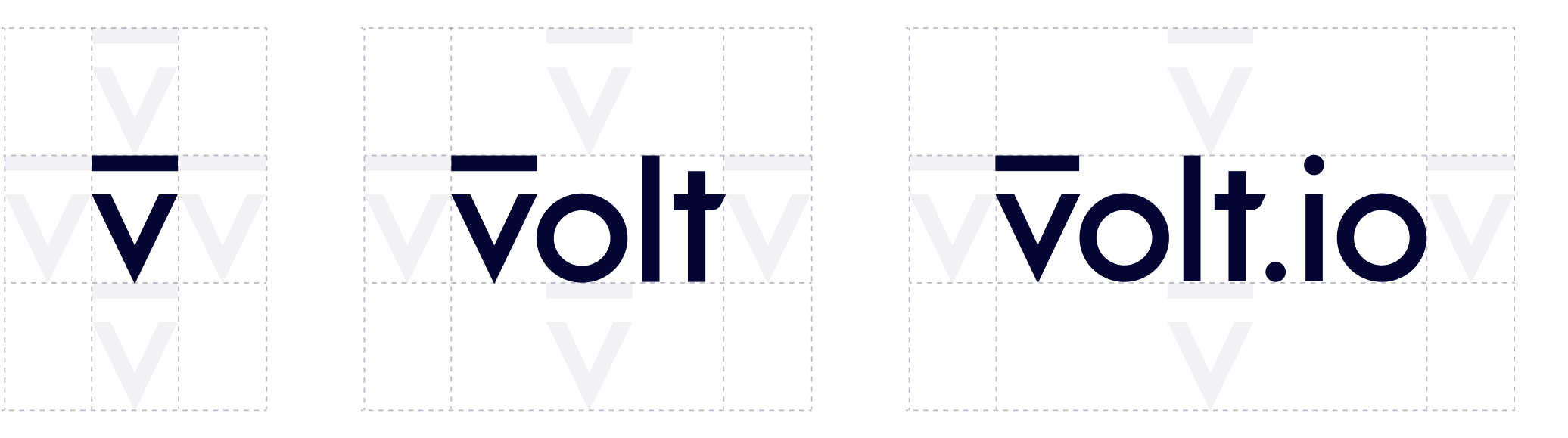
Additional variants
The Volt master V and descriptor are key supporting elements of our brand expression.
We enlist the master V and descriptor to reinforce brand recognition in low-awareness markets, always superseded by the logomark. We enlist the descriptor to reinforce brand recognition and to act as a call to action to drive traffic to our website.
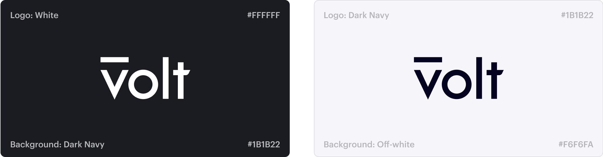
Colour variants
The Volt logomark should only be used on a Volt Navy background in white or on an off-white background in Volt Navy.
Using our logomark
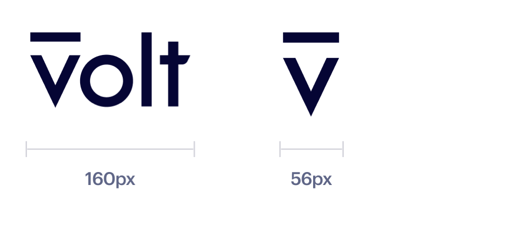
Sizing
Establishing a minimum size ensures that the impact and legibility of the logo aren't compromised.
The minimum size of primary logo is 16mm in width for print or 64px for digital. When the logo is made any smaller, the default option is to use the master V for improved clarity.
Maximum sizing
Minimum sizing
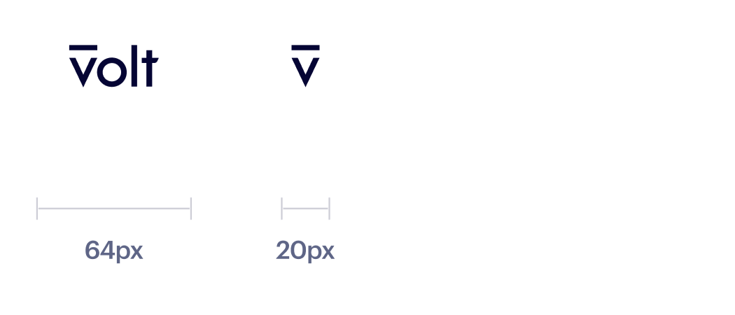
Exclusion zone
We're a confident brand. We never crowd our logos and always give them room to breathe and stand out.
The exclusion zone is an invisible barrier around the logo and icon that protects them and allows them to breathe. No other elements should be placed inside the exclusion zone.
The exclusion zone is equal to the height or width of the letter 'v' in the Volt wordmark as shown.
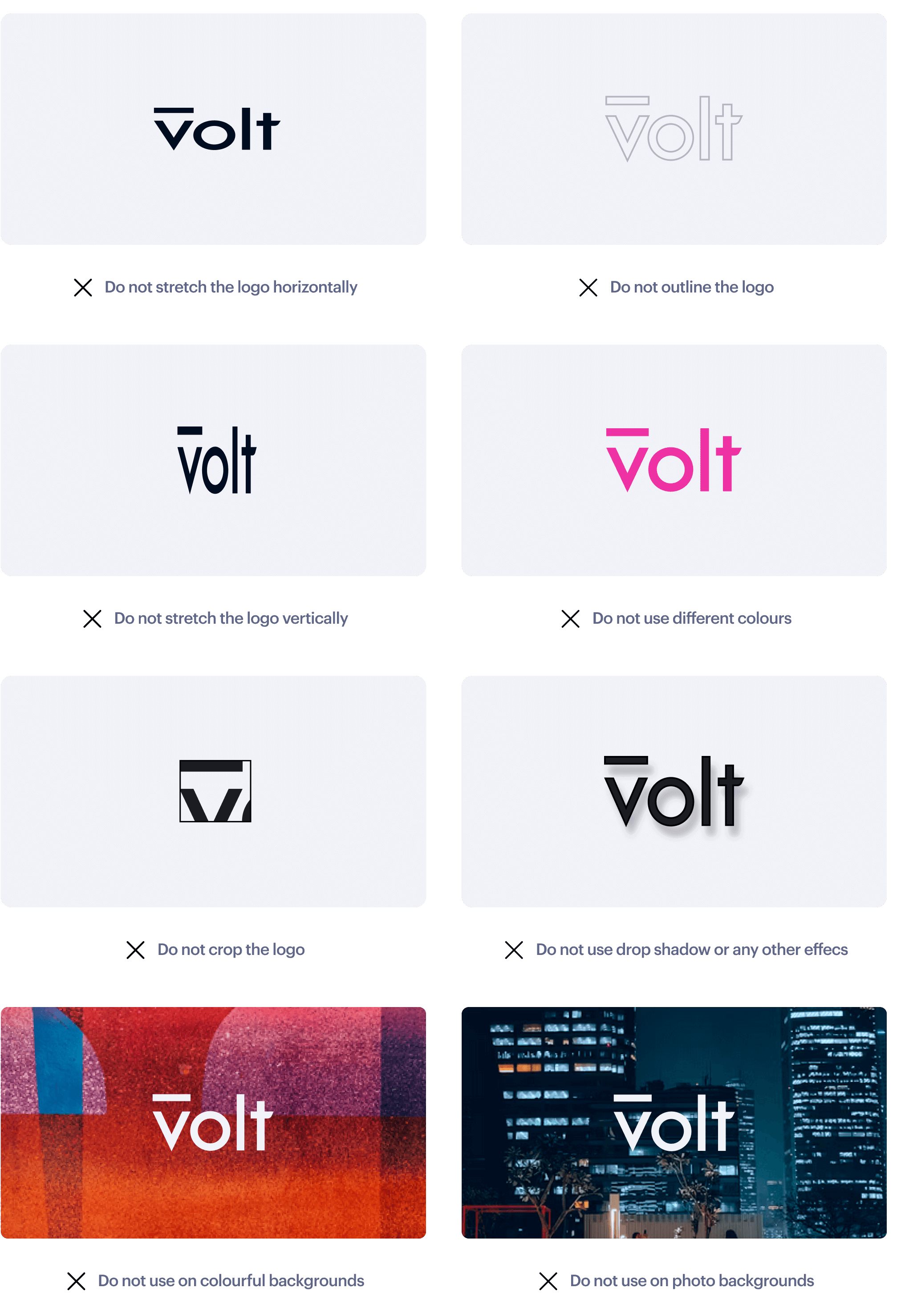
Misuse
It's important that the appearance of the logo remains consistent. The logo should not be misinterpreted, modified, or added to.
Its orientation, colour, and composition should remain as indicated in this document — there are no exceptions.
How is this guide?
Last updated on